THE FISHMAN
[set, roughly, to the meter of Edgar Allen Poe’s “The Raven”]
 Once upon a midnight dreary, while I pondered weak and weary,
having just returned from GDC a couple days before,
lying in my bed with con flu, none too happily sorting through
the impressions of the journalists who visited before.
“They struggled with the game,” I muttered, “having never played before.
These struggles I do so deplore.”
 Ah, distinctly, I remember, it was in my warmest sweater,
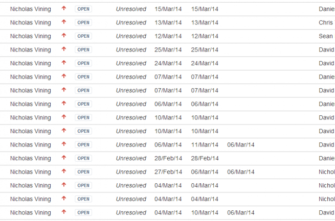
as each JIRA ticket crashed like waves upon the ocean shore.
Eagerly I watched the replays, studying hard and searching for ways
to improve the user’s gateway into CE’s dreadful lore.
The mouse clicks were not working, as they once had worked before,
for putting things onto the floor.
Soon we fixed all the selections, having had some recollections
of examining only boxes when selecting some decor.
Now by checking each triangle, we would surely find an angle
which would soon help us untangle what the user chose before.
“This improves the gameplay greatly,” said Daniel to me once more,
“You fixed this bug. Now go fix more.”
 Yet again I searched the feedback, stopping now and then to backtrack
to get yet more jet-black coffee from which I derived succor.
Suddenly, there came a rapping, in the game, and then some crapping-
out of all my subjects, trying to get through a door.
“An inability,” I muttered, “of someone pathing through the door.
I haven’t seen this bug before.”
 With a face just like formica, I moodily passed the bug to Micah,
sending him a righteous e-mail which I’m sure he would deplore.
Soon he came back with a mocking “We don’t always check for blocking,
trying to pathfind to a cot which we have not tested before.
We need to now disable modules we could not path to before –
only this, and nothing more.”
 “We need feedback!” shouted David, his ebullience ebated,
having restored his patience with tofu the night before.
“Show the user, placing modules, all the useful access nodules
which a character will use to work machines upon the floor.
In this way an artisan shall have a workshop to explore
free of problems, ever more.”
 “But the memories,” shouted Daniel, his emotions slightly scrambled
as he rambled, having been compared to Molyneux before
by some moody British journos, from a well-known site that you know,
whose reviews had set him aglow but left him shaken to his core.
“Players cannot see what their characters have seen in times of yore.
We need not less UI, but more!”
 “Fix the workshops! Fix the clicking! Fix the animation rigging!
Fix the particles that lay leaking memory upon the floor.
All these things must soon be resolved, if we are to go and solve
our UX woes and to evolve into the game that our fans so adore.
We can’t go to to Early Access, releasing this game to the masses with
these bugs they so deplore.”
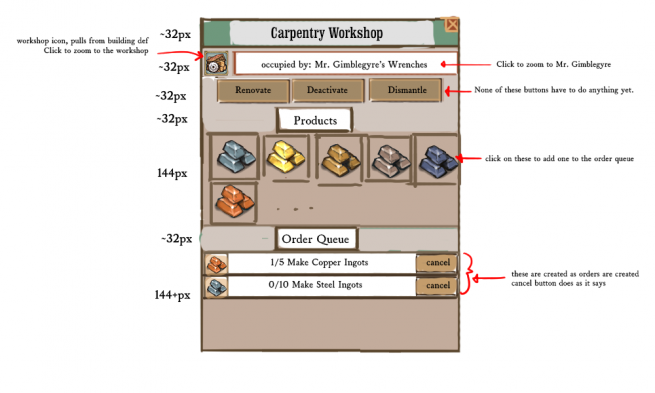
 “Here’s some mockups! Here’s some pictures! Here’s a hundred brand new features,
slowly creeping… wait, you’re weeping! Weeping now upon the floor.”
With my lowly visage shattered, as my keyboard gently clattered
off my desk I pitter-pattered down the hallway to the door.
I knew I must flee the office, for the silence of the shore,
for I knew too well the score.
 By the ocean waves I shivered, and I soon felt my neck quiver,
as gills erupted from my neck where there were no gills before.
Casting aside all my ambition to bring my game unto fruition,
I ripped off all my clothing and bolted for the ocean floor.
It’s far better to envision a brand new life as a fishman
than to try to ship a game once more.
Quoth the Vining, “Nevermore.”
Ahem! *tap tap*
Someone left this thing on. And there’s some kind of watery trail leading toward the sea. Anyway, David here, and in other news you may have noticed that we’ve updated clockworkempires.com a bit with a more thorough press roundup of GDC coverage and a screenshot or two just to freshen things up. Things are starting to go
Thank you again to Chestnut St. Pixel Foundry for a lovely website design and Derek, our Gaslamp Games Web Overseer and Totaly Not A Fish Person for connecting all the pipes.


I love you guys 🙂
*Standing ovation*
This is why this is the best development blog ever!
Bravo! Bravo! *throws sardine*.
This is an amazing piece of literary drivel, I mean work!
Thanks much!!
p.s. I like either of the mockup with circles.
Another vote for the (more cog like) circles over the squares.
Like the idea of the more compact design on the left for veterans, and the more expansive view in the middle for new players/help view (if such a thing is possible)
Fun!
I am partial to the first character bio UI. Scrolling over the icons gives you more detail about what is influencing the character, but once you are familiar with their meanings, you can see what the character is thinking at a glance.
Though the “emboldened by work” and “ambivalent about soup” icons look as though they might sometimes read “disheartened by work” or “rejuvenated by work.” Perhaps a colour code or some +/- iconography might help users read at a a glance the way the character is feeling about a particular experience?
Looks great, keep it up! – N
I didn’t read your mockups clearly at all, and I also typed “work” when I meant “soup” (which ACTUALLY should have read “stew”, so maybe I’m just losing it over here).
At any rate, my point stays the same: simple icons, but I’d personally go for some positive or negative variations.
Colored rings around the icon, maybe?
Won’t really work, because each memory is not just “good” or “bad”, and some people feel unusual reactions to memories based on traits. We will probably let the player infer what the effect might be for a character, and highlight them if a specific relationship or trait makes them feel unusually about something.
Ah, fair ’nuff! Whatever you do will be great I am sure.
You guys should really include this poem in a tome in the game somewhere as an Easter egg of some sort. Super clever work, and very much enjoyed!
-also throws bouquet of sardines!
My god, its glorious. Though, more features are never bad.
That was amazing.
You had me at ‘”ambivalent about soup”.
“You fixed this bug. Now go fix more.”
Poor Nicholas. I could almost feel your shoulders slump when I read this.
If its any consolation, that was the best thing i’ve read in a long time.
…even though you broke down into tears and turned into a fish person in the end.
I suppose programming tends to do that to everyone in the end.
ebated = abated?
My favorite rhymes:
formica with Micah
envision with fishman
That was amazing, honestly i’d pay you guys just for the weblog updates :D. Looking forward to the actual game!
Long time, no comment.
Just my two cents, the the middle shot is definitely my favourite. I’d definitely prefer seeing everything at a glance rather than memorising the meaning of icons – particularly as it seems like there will be alot of icons.
Also it seems like tooltipping over each icon for long lasting characters would be a pain.
BTW guys, can we have screen shots of the pipes connecting buildings? Really curious about them.
You’re referring to the middle shot as the the middle shot. I didn’t know the the middle shot was actually named. I seemed to have missed that in this otherwise very talented post.
On topic: I like the middle one too.
Sorta on topic: I like turtles.
Wow.
For a total of four cents (you’re making a bit out of these comments aren’t you!):
I think I like the layout of the central mockup with the descriptions of the right mockup, with an option to enable the left mockup for advanced players.