Author Archives: David

Video Games Podcasts I Listen To

Or: Why I listen to people talk about playing games instead of actually playing games.

Mostly.

I’m an artist, right? Right. I draw using my computer pretty much all the time. It’s what I do. Drawing (or ‘digital painting’ or ‘pixeling’ or whatever it is) doesn’t particularly engage the part of my brain that involves language unless I’m actually doing higher-level design. A lot of it is just painting away at something or pushing a lot of pixels. Oftentimes it’s not supremely engaging stuff like drawing lots and lots of bricks or painting lots and lots of clouds – all good and necessary things, yes, but the mind tends to wander. So I listen to stuff. Music works oftentimes, and the emotional content of the music often finds its way in to my art. Other times I want to listen to something I can think about, something relevant to what I’d like to be doing: game design.

I listen to internet audio shows about games. For some reason Apple has convinced us that these audio shows are to be called podcasts, and just as I eventually gave in to using the word “blog”, so too shall I adopt use of the word “podcast”.

These are the podcasts to which I continue to listen, with some of my thoughts.

{ read this article }

Posted in Game Design | Tagged ,
Leave a comment

Game Design Dialectic: Dwarf Fortress and Goblin Camp

This is only the beginning of a story, but it could prove to be a very interesting story if it bears out. I think it already contains instructive lessons for game development and design.

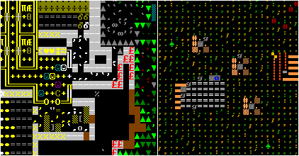
On the left, Dwarf Fortress. On the right, Goblin Camp.

I hope you know about Dwarf Fortress, the very complex roguelike-lookinglike fantasy world sim / citybuilder. From a development perspective, DF is a very long-running obsessive project coded by one guy, Tarn Adams, who makes more money than I do (not difficult) entirely by donations from his fans. I admire Tarn’s goals and his creative freedom which lets him indulge his whims – I wish I could do that. I even had fun playing some Dwarf Fortress until I explored most of what there was to explore. It was sweet while it lasted, but I grew tired with the tedium of a very rough user interface and tedious gameplay.

{ read this article }

Posted in Game Design | Tagged , , ,
5 Comments

Against Pixel Art Formalism

[Begin faux-manifesto.]

Pixel art is for the pixels!

I don’t care for being formalistic about pixel art, of adhering to a limited palette or carefully anti-aliasing my lines by hand, of using all-or-nothing transparency (actually, I do the latter two more often than I’d like to admit). What matters is what I wish to do with the aesthetic of pixels – and what specifications I must meet for the graphics to work at all in the given platform. It is ridiculous to throw away perfectly good tools like brush effects, gradient tools, and overall image adjustments. Tedium is not artistically uplifting.

If the art is about pixels, it’s pixel art. It doesn’t matter how I make it.

I actually followed all the “rules” of pixel art to draw these. Oops. Then I used the adjust levels tool in Photoshop. Ha! I have overthrown the tyranny of aesthetic canon!

There! It’s not a manifesto unless you try to sound controversial in the first paragraph.

{ read this article }

Posted in Dungeons of Dredmor | Tagged ,
1 Comment

Dungeon Creation and Beautification

With most of the foundational art assets completed I’m shifted my focus on Dredmor toward producing content for the game. In particular I’m polishing the dungeon tilesets and creating new dungeon objects (as the game items have actually been finished for a long, long time).

Tilesets

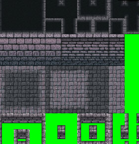
Let me take a moment to explain how Dredmor tilesets work (and used to work, and how they will work). Here’s a cut from the first dungeon’s tileset:

{ read this article }

Posted in Dungeons of Dredmor | Tagged , ,
1 Comment

Gaslamp Portrait Sketches

For the Great Gaslamp Webpage Revival I’ve started drawing steampunk portraits of the crew of the good ship Gaslamp Games.

(click to view full size)

From left to right: Nicholas, deranged technologist/bootlegger; David (myself), foppish art-lord; Derek, internet-tube engineer; and Daniel, merchant of ludology and man of science.

{ read this article }

Posted in Gaslamp, Website | Tagged ,
3 Comments

The Part Of Making Games That Isn’t Making Games

  1. Make game
  2. ???
  3. Profit!

Something is missing here, see, and what’s missing is what really does the trick for the commercial indie game development thing. It is those developers that can fill in point number 2 that are successful, I think, regardless of any sort of brilliance in point number 1 (and sometimes making up for a lack of it).

We’re all doing something to carry some of the weight of step two, Derek handling hosting and coding online things, Daniel spearheaded incorporation and is our business guy probably because everyone else hates the idea of doing it more, and Nicholas has shadowy “industry connections”.

As for me? I do art. And it turns out there’s more to a game than the graphics.

{ read this article }

Posted in Dungeons of Dredmor, Gaslamp, Website | Tagged ,
2 Comments

The Insane Vortex of UI Redesign

This wouldn’t be Gaslamp if we didn’t completely redo a major game system once a week.
And this wouldn’t be the ongoing Dungeons of Dredmor beta if we didn’t completely redo between three and five major game systems every week!

Let’s talk about UI redesign.

Here’s the main game UI in Dredmor 0.4:

(Click on any of these images to view at full size.)

Not so bad, right? Rather archaic and clunky, perhaps. But the clunky UI has what we might call character.

{ read this article }

Posted in Dungeons of Dredmor | Tagged ,
Leave a comment

Experimental Perspectives on Tilesetting

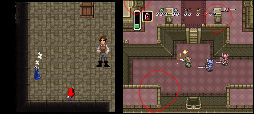
We’ve got a little design problem in Dredmor that Daniel has named “fighting arrows”. See the little arrow at the bottom of the screenshot on the left? It points to a blobby-monster just poking its little eyes out from behind a wall that otherwise covers it up. The arrow is a helper icon to make sure you notice that there’s a monster.

No, this is not elegant. We’ve also got issues with doors being difficult to see behind walls. Well then, how do games deal with the problem of stuff hiding behind walls?

One solution which came up was that of Zelda: A Link to the Past — they made it so that there is no ‘behind’ walls. See the right screenshot: everything has a rather subjective take on perspective. The player sees the face of all of the walls, no matter what direction they face! One column is seen from the front, another is seen from the right, and there is even some weird overlapping balcony thing. The world of A Link to the Past has a take on perspective that would make Escher proud, and the game manages to get away with it.

Could we?

{ read this article }

Posted in Dungeons of Dredmor | Tagged
1 Comment