There’s a tired joke one might hear in a restaurant when your meal is taking too long which goes something like “I guess they had to go catch the chicken before they could cook it.” This doesn’t actually happen in restaurants (probably), but it does happen in software development all the time.
When you want to do something new, you rely on having a significant chunk of code to build upon. But occasionally you have to go back and fill in things that you never realized you needed. Thankfully, unlike the restaurant joke, it’s not always such a great time sink. Having to go back and rework previous code can be done with the benefit of hindsight, and often lets you maybe make some low-effort changes that impart significant improvement to the software.
…Which is why I started this month working on the occult systems in the game, but found myself making some low effort changes to how our UI works which will benefit the systems coming down the pipe: not just the occult systems, but basically everything.
(The occult stuff is still coming of course, but that’s the topic for a later blog post.)
Over the last year I’ve been spending my spare cycles between systems projects overhauling various UI elements throughout the game to try to make those systems more transparent and therefore easier to interact with. So far the work crews UI panel has had some pretty serious work done to it, as has the character info panel. We’ve also collectively been working on some changes which are visible in the various “office” UI windows such as the church, the laboratory, and the foreign office.
The last thing I expected to do anything with was the main gameplay window’s UI, but we’ve been learning a lot about what elements are the most useful through how people play the game. So the time has come to give it a little love, because it was getting cluttered and we had some painfully good ideas about what needed to be fixed.
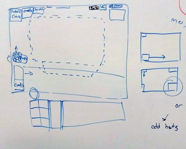
Rule 1: Keep the top 3/4 of the game window (aka “the main viewing area”) as clear as possible so you can see what is going on in the game.
(Well, actually, the top 3/4 but we can put some stuff on the left and the right. here’s a little picture we drew)
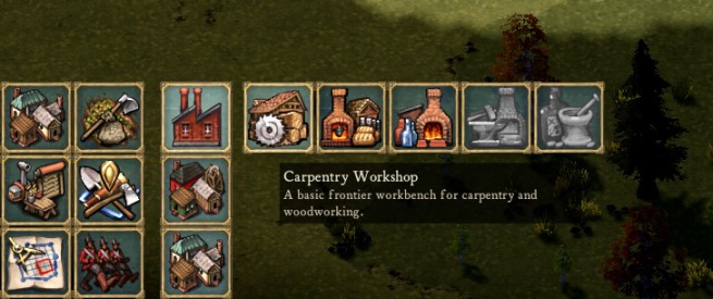
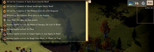
We were breaking this rule pretty badly with our gigantic modules window, but we had nowhere to put a UI container for that many buttons which wouldn’t overflow the main viewing area. The largest contiguous piece of usable space we had was along the bottom, but the dialog box was in the bottom right. So why was the dialog box down there? Well, we wanted it out of the way because it was large, and it was large to give it space enough to display past events, but most of the time players only care about the most recent entry, occasionally scrolling through it to find records. If we made it collapsible, then we could make it smaller, and if we made it smaller, then we could move it somewhere else and free up that bottom space for the commands. How about the top center of the screen? That looks pretty good!
Now we can use all that space outside our main viewing area for modules, and they won’t get in the way while you’re designing a building. This has an added benefit of allowing the UI to flow from left to right, which is probably a little preferential treatment to the tendency of western languages which have trained people to read this direction, but it does feel much more natural.
The buttons along the top have also changed! We’ve gotten rid of a few elements that were no longer valuable given how we shifted our design (why have an artisan counter when that character type doesn’t exist anymore?), and we’ve reordered them to be grouped in more rational ways.
Finally, we now have a reasonable course of action to make the alerts (the icons that show up along the right-hand side when a character dies etc.) more visible and manageable. We simply have to move them from being in literally the least used part of the main UI to above the commands buttons, the most used part of the main UI. We have further plans to reduce alert spam in the cases of starvation and death which will come along a bit later.
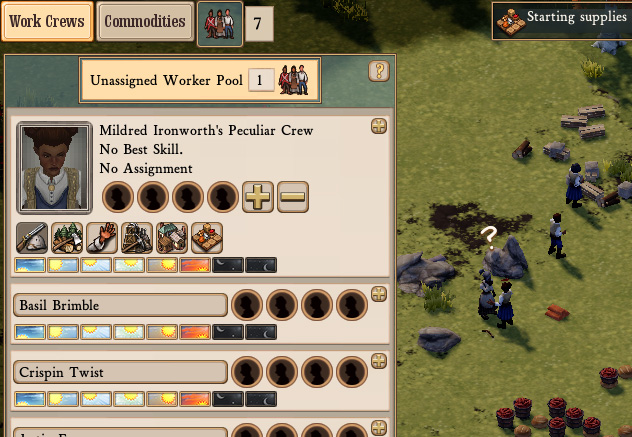
While I was at it I implemented a few requests that sounded like good ideas for our work crew UI:
- New lower class characters are no longer auto-assigned to work crews.
- The Work Crews button now glows if there are unassigned lower class characters (in addition to the characters having the “?” above them in-world).
- The “Unassigned Workers” section of the work crews UI also glows (the same color) when there are unassigned workers.
- The work crews UI now has a help window button much like the others that have been popping up in the game to help introduce new players to how the UI works.
- And finally, rather than simply darkening the background of a work crew that’s been assigned to a building, they’re getting textures which correspond to the building they’re assigned to. (Yeah, this was me probably being overly precious, but I like it and it only took an hour.)
These changes should be in with 48B, and now that the main UI is in a bit better of a state, the occult system can hook into it in a meaningful way.
Night time will not be boring.


Oo, I like the sound of UI refinement. If I could make a small suggestion, could crews assigned to a Farm also get some kind of darkened background?
David already made it! I just don’t have an exceptional way to hook it up yet, but we’re working on it.
I’m so glad you’re continuing to refine the UI. I love the direction this game is going!
In Case no one has mentioned it before, Can you do something about how the Close Window Button is right next to the Red X Destroy Building button? They’re very close in the UI and has tripped me up a few times.
Making those buttons that you Press Most often (like closing a window), receive some extra Care/Love would be appreciated.
Also, assigning immigrants to a work crew instead of them automatically being assigned is SOOOO APPRECIATED!!!
Thank you and Keep up the Good work guys!
I’ve only been playing a month, but I check out your website every day for anything new.
Is the best place to report Bug/Feature Errors on the Forums?
Ah, UI improvement. Oft’ unsung in praises, yet always greatly appreciated.
If I might make one minor UX request, could we please have draggable orderings in item queues? Having to aim and click the tiny arrow buttons over and over again to move something up the list is frustrating, and actually significantly changes how I play the game – instead of building specialist modules to order, I try and guess my build order in advance and put everything in at once when the building is constructed. Which is stupid. Similarly, I’d really like to be able to re-order the work crew list, although that’s less important.
LOL, I’m sorry I said night time was boring. Can’t wait to try the new UI design out, sounds great.
New lower class characters are no longer auto-assigned to work crews.
YES!
Agreed, this is terrific. ‘No, you slacker, you cannot just go hang out with the vicar, PICK UP A HOE’
I never understood why I would wind up with work crews of 7 people and yet be unable to put more than 4 into a military group.
Will it be possible in the nearish future to have toggleable alerts? I would appreciate knowing when my Hard-Working Citizens have been attacked before they’re already dead and it’s too late to do anything about it.
I saw the title and thought domesticated chickens were finally a thing. Still glad to see improvements in the UI, but please add animal husbandry soon!