This wouldn’t be Gaslamp if we didn’t completely redo a major game system once a week.
And this wouldn’t be the ongoing Dungeons of Dredmor beta if we didn’t completely redo between three and five major game systems every week!
Let’s talk about UI redesign.
Here’s the main game UI in Dredmor 0.4:
(Click on any of these images to view at full size.)
Not so bad, right? Rather archaic and clunky, perhaps. But the clunky UI has what we might call character.
I think that the defining feature of Dredmor is not elegant gameplay, great graphics, or cutting-edge technology — it is character: zaniness, a weird ‘take’ on everything. We reference Doom, Diablo, and Ultima with the UI, and I imagine people who understand Dredmor are people who have nostalgia for those old games. And this old thing is finally getting to a useful place with the auto-loading of starting skills and the keyboard hotkey number implemented.
Still, the UI has been problematic and it does look old. I’m quite torn on the issue of revising it, but we’ve had some ideas kicking around and after arguing with Daniel which ended with me coming around to possibly trying a new model for the UI, we started in on The Madness. They key idea is to improve skills interactivity, to make them easy and intuitive to use by having skills act more like items and, at the same time, to have items act a little more rationally. (For example, if you’re standing back and merrily shooting a cluster of enemies with a crossbow and you fail to notice that you’ve run out of bolts, your next click on an enemy will cause you to walk over into the group of enemies … which is exactly where you don’t want to be, presumably because you were off with a crossbow doing crossbow things because you’ve wanted to avoid melee combat.)
A lot of that is about the coded interactivity of the objects. Weird things are happening in the next patch; it takes some getting used to the new metaphor for interacting with skills, objects, and the new, combined quick-use bar, but I think it’s working. And I’m getting ahead of myself.
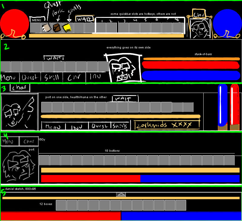
Back to the visuals: How could we redo the UI to be sleek and efficient, to use the new skills-as-items model? I drew some quick sketches.
I must admit, I actually drew these in reverse order, from 5 to 1, and 1 is based on a very rough sketch that Daniel sent me (by taking a picture of a drawing on paper, of all things). I rather like the top one with the Diablo-style health and mana orbs because it retains the character portrait box and goes with the rather radical move of making major UI elements like the quests, inventory, and skills accessible only through items (which we’d make very, very sure the player could not lose.)
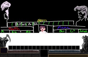
As either a conservative or intermediate step, who knows, I quickly adapted the old UI to the one quickbar model, based on a charming sketch by our dashing lead programmer, Nicholas. [He’ll probably hate me for showing the world his drawing, but I thought it was so adorable that I had to save it … with multiple backups.]
I quite like how the statue on the left has grown a beard in his interpretation.
Here, then, is a mockup of the new minimalistic game UI and then a first draft’s implementation which is in the working code and will likely be released in some form or another with beta version 0.6. This is just the visuals; Interaction is changing a lot as well, but implementation of that is more Daniel’s domain.
It’s quite a change, and it does lose something of the character of the old UI — and the portrait is cut entirely out, but then I didn’t look forward to drawing 28 of those. Hopefully we make up for this loss with some very interesting gains in other areas of the game … which is a subject that shall have to wait to be discussion until another day.


