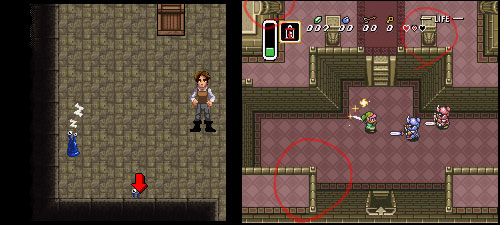
We’ve got a little design problem in Dredmor that Daniel has named “fighting arrows”. See the little arrow at the bottom of the screenshot on the left? It points to a blobby-monster just poking its little eyes out from behind a wall that otherwise covers it up. The arrow is a helper icon to make sure you notice that there’s a monster.
No, this is not elegant. We’ve also got issues with doors being difficult to see behind walls. Well then, how do games deal with the problem of stuff hiding behind walls?
One solution which came up was that of Zelda: A Link to the Past — they made it so that there is no ‘behind’ walls. See the right screenshot: everything has a rather subjective take on perspective. The player sees the face of all of the walls, no matter what direction they face! One column is seen from the front, another is seen from the right, and there is even some weird overlapping balcony thing. The world of A Link to the Past has a take on perspective that would make Escher proud, and the game manages to get away with it.
Could we?

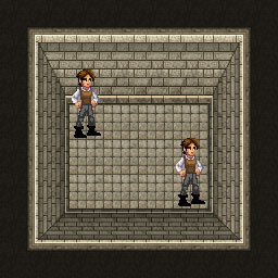
I threw together some test graphics last night.

It would be painful to redraw all the tilesets, but it could be done, and a couple could be cheesily re-colored or something to cover all the dungeon levels. But what it comes down to is that the perspective our player character and monsters are drawn in is way too much looking like a strong front-view. All the characters in Zelda are, if you notice, rather squat, like they’re being viewed largely from above. And they’re smaller, just a bit more stylized, visually contextualized in a looser manner that lets them exist in an environment with a fantastic interpretation of perspective.
From talking it over with Nicholas, it sound like we could have gotten away with it if we’d designed the game this way from the very beginning (which was what, six years ago? And I’ve only been around for nearly two. Oh, and how many things I would change if I could have been there to help design the visuals of this game from the start!) Alas, we’re locked into a certain direction with only so much room to maneuver. Re-writing the rendering and dungeon-building code and redrawing all the tilesets is a bit too extreme a maneuver, I’m sorry to say. And before anyone suggests it, I think Nicholas would go into some kind of coffee-fueled berserker rage if we suggested he re-write the rendering code to support transparency masks or wall opacity when we’re halfway(?) through the game’s beta.
Don’t worry, we’ve still got tricks up our wizard’s sleeve.

As a curiosity, what if you flipped the transparency around? I.e. Instead of wall transparency, you simply drew obscured things partially-transparent over the walls? Or, if transparency is not easy to come by in the codebase, maybe a shadowy, black silhouette of the creature (with, perhaps, white outline to ensure visibility on dark tiles)?
Dunno if that is useful or not…just came to mind when I read this post.
Josh