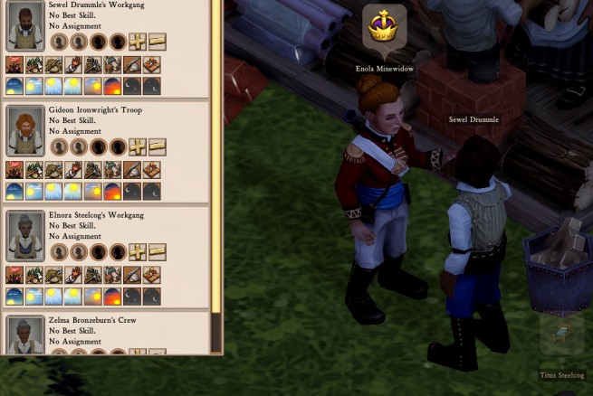
Now that we have a much more detailed view of how we envision the specifics of Clockwork Empires, we’ve been revisiting much of the UI we initially wrote to carry us this far. Now we’re looking at it with an eye for usability and better presenting the information that should be important and visible to the player. You may recall the revamp of the Work Crews element last month – the element that we’re looking at right now is the character information panel.
We have been getting away with a very crude character UI because most people don’t seem to expect that a deep, complex character simulation is going to give you a way to immediately decipher exactly what is going on within that character. Not only is that a tall order to ask for a user interface but it might even lower your appreciation for the simulation by peeling back the curtain a bit too far. A certain element of mystery can be a good thing.

