We have these little turns of phrase to represent design concepts. One such phrase going back to Dredmor is “put it in the Hat Pack”. I consider this a form of subtractive design.
So: The Hat Pack is an expansion pack for the game you’re working on which is shrouded in the mists of the future yet-to-be. (And as the name suggests, the content is a bunch of useless hats.) You put a feature or idea into the Hat Pack when you need to kill it, cut it, remove it from the game; but you don’t have the heart to kill it. So you quietly put it in the Hat Pack and shove it at the back of a closet to be slowly forgot.
(Or not. I want to say that features have legitimately been revived from the Hat Pack, but the notable example that comes to mind is the facial hair equipment slot for Dredmor that involved a bunch of false beards and mustaches to enhance your powers. Never happened.)
We’re currently hatpacking things for Clockwork Empires. For the majority of development, ideas flow free and wild and get crammed in half-implemented and commented out. Then at some point you have to clean this up and really hone your game design to what is going to work and what is not. As much as players love the idea of a million complex features, the reality is that a loose ball of dangling feature-hooks is not a very fun game.
An important consideration of hatpacking is that we can’t tell players about it. If we let slip every feature we thought would be cool then later cut, players would be petitioning to include everything. It’s not like we don’t understand – we love piles of cool, zany ideas! – but the reality of project management is you can’t have everything. And this drives us crazy. And it’d drive you even more crazy if you knew about it.
So, throw it in the Hat Pack and pledge the blood-oath of silence.
Now with that point made, there is one area where I’m performing subtractive design that’s sufficiently unrelated directly to gameplay that I am comfortable telling you about it. And that’s in cleaning up the UI definitions and assets!
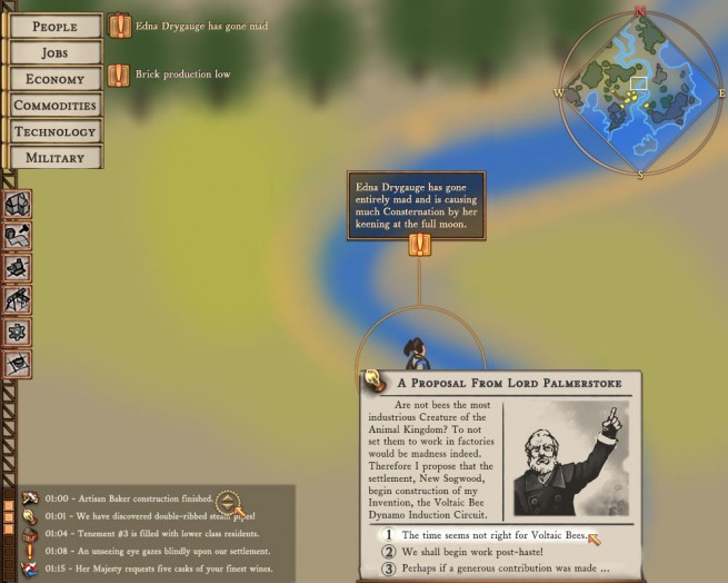
When we first started work on the UI, I drew a bunch of stuff and we jammed it together completely ad-hoc and rather haphazardly. You can see this process in Nicholas’ post from December 30 wherein he decided to post ancient pictures of the UI.
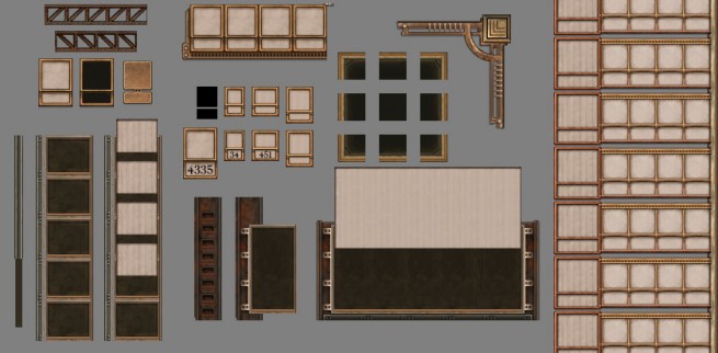
The direction of the old UI art was much more representational; lots of trestles, rivets, cogs, pipes, and general gluegunned steampunk filler stuck on. This did not work particularly well because the system itself did not easily support decor elements, it was a huge pain to iterate, and it was visually messy.

A UI mockup from several years ago, largely inspired by something between Impressions citybuilders and Paradox. It has basically all the core elements in some form.
The intricate, highly rendered UI art certainly looked cool on its own, but this is the forest and trees art problem. This is art being made for a game, a complex system with a lot of interconnected and moving parts. It matters not a damn if the art looks good on its own on a blank background – all that matters is how it operates as a part of the whole experience. If a series of rivets and trestles on the UI stand out too much and overwhelm the objects in the game scene proper, then the UI is not doing its job correctly.
Further, there are a series of style definition files unique to various elements – default vs. gameplay ui vs. mainmenu ui vs. workcrew window etc. These files grew as each element was placeholdered, but it turns out they were reproducing data. And we were being misleading via UI by (for example) having buttons look one way on one screen and a different way on another (which is okay so long as they have common visual language, but they didn’t really in this case). There were also a lot of files defining UI for elements that no longer exist!
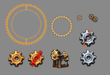
So, purging! I’ve been unifying the style definitions so everything is in one place, so if we want to alter one style of button, all elements inherit the correct style. Old files pointing at things that don’t exist are being deleted, old art that nothing is pointing at is getting deleted (though it is all saved, of course, in the Hat Pack in case we want to make a fantastic cogwhizzling UI element in the future).

Some of this is super unwieldy and I hate it. Some of it is really cool and may yet see use. None of it is currently in the game, but with everything cleaned up, it’d be trivial to add back in if an opportunity presents itself.
This rationalizing of the back-end of the UI system’s data will simplify our effort to clean up the game’s UI, a process we’ve seen slowly rolling across the windows and widgets of Clockwork Empires in the past few months.
It’s all so … clean.


I like the level of caution in that date tag
1. put mustaches and beards in random hat pack drops
2. youtubers start making 3 hour videos of opening hat packs hoping for that “Rare Groucho”
3. sales skyrocket
Good lord that’s brilliant.
Haven’t you folks hatpacked enough stuff already? I still remember the absurd multitude of workshops in release 0.31 or thereabouts…
To be fair, when it comes to workshops that’s been a process of consolidation rather than cutting of features/assets (except, I suppose, some icons and wall textures). In fact, the number of things you can produce has surely increased in scope even if they’re made in fewer different workshops.
A separate notion of a “brewery” might still be a neat idea for a megaproject.
Yeah, but apart from that (and the elusive power saw) I still remember early features like steam pipe networks and all those weird axle things.
As david says above, we haven’t actually removed any workshop content; rather, we merged a number of them. (The Arsenal into the Metalworks, and the Brewery into the Kitchen, among others.) Same modules and uses, but all under a single roof!
I personally feel the kitchen/brewery is a bit crowded and needs to be separated once more. This is especially true when given the colonists’ viewpoints of comfort versus crampness (if crampness is a word).
You can just make another “kitchen” which only holds the brewing modules.
Hat packing is what makes a good game great. I’m especially glad to hear work is happening on standardising the UI elements – a well organised UI helps discoverability immensely and lets you do more complicated stuff for the same mental overhead.
Always love reading these!
Voltaïc Bees ?
I definitely want those.