One of the first years we were lucky enough to go to GDC (a yearly game developer conference), we had breakfast with a guy who worked at Bullfrog during their heyday. He told us a story about one of their games that’s been echoing in my head for years since.
During development of the title (which we will call “Cheese Wrangler” to protect the innocent) they created a sophisticated simulation of the environment to determine which challenges to present to the player. Months of painstaking work went into cheese wrangling challenge* simulation in an attempt to create a model that would feel intuitive to players, but the system was taking way too long to finish. Eventually they decided to test players against a purely random event driver, and they found that after all that work players couldn’t tell the difference between simulation and chance. So they threw out the simulation.
(*Not actually cheese wrangling challenges, but we’re sticking with that theme.)
Simulation just doesn’t matter if the player doesn’t care about it.
This is one of the biggest driving factors to why games often don’t have sophisticated AI. Once you jump the hurdles of the cost of development time for the systems and the computational cost within the game, you have to determine how to make the player care, or you might as well have thrown a RNG at the problem and moved on a week later.
We have part of this problem. We have a lovely, deep, complex AI, and if you know what’s going on under the hood it seriously out-performs random behavior, but we haven’t been doing a good enough job of making players care because we aren’t giving them the tools they need to care.
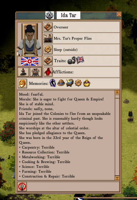
The window into this problem was intended to be the character info panel, but in the initial version of it, you had to read repetitive descriptive paragraphs for every character in order to figure out why they were upset, and often the information wasn’t valuable in the first place. No one used it, because of course they didn’t. It sucked.

I can’t find a screenshot of this first version, so here’s an artist’s rendition of UI improvement.
The next version we improved the visibility of the information by making the memories that were most important to the character visibly distinct as icons, which was great, but they weren’t all unique. It was the tooltips holding the unique data, so players had to mouse over all of them in turn to read them to try to figure out why the character had a particular mood. So tedious. Nope, that sucks too.

Sorry Ida, but it seems like no one cares about your problems.
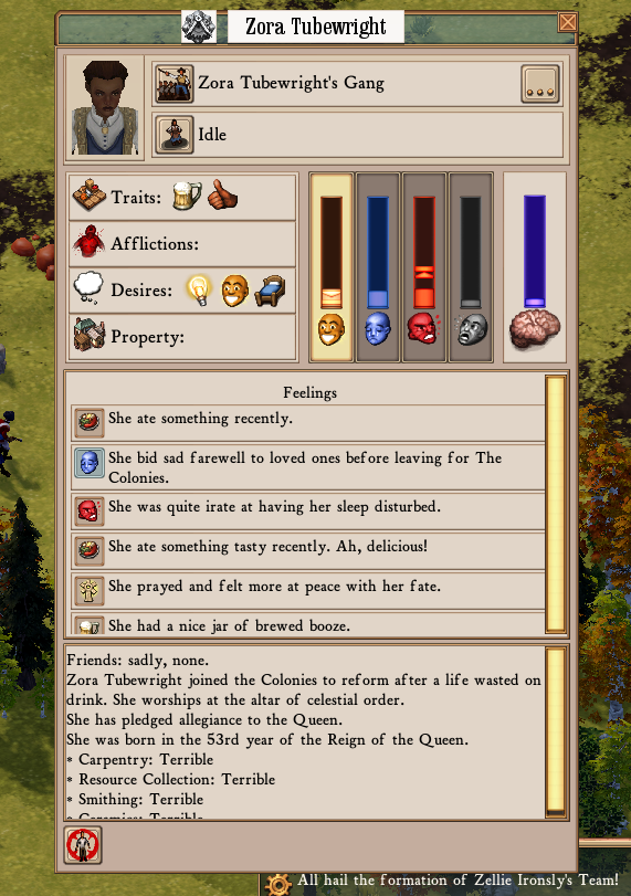
Starting with this experimental I decided that hiding the information was the problem, so I’ve been tearing through our emotion simulation code exposing everything I possibly can to the player. The character doesn’t have one mood that governs everything, so we should show them the entire state. Done. The character was deriving their emotional state from dozens of memories, and we were only showing the most important ones. Why I ever thought this was a good idea I will never know. [It was the laudanum -ed.] Enough with that, let’s just base the state on the ones we were showing in the first place. Does it change how characters act? Not really. Does it improve the player experience? YES! A LOT. Giving players access to the entire character state, one way or another, is the only way they start to trust the UI. The harder it is for them to access the entire state, the less they’re likely to trust it.

Okay Josephine, we’re starting to care. But we’re also confused.
Cool, so all of the data in one place! Not cool: there’s so much data. This system was never intended to be visualized. And so begins the refinement of the system: cropping off features that weren’t adding enough value to bother trying to explain, sanding down the ones that were overly indulgent, and creating a presentation of what’s left that is intuitive enough for players to understand and still interesting enough that they’ll use it a lot.

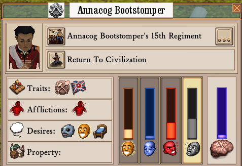
Tell us about your feelings, Zora!
I’m not going to spell out how this works, or why, because I can’t. It’d render useless too much feedback. But I can say that I’m really excited to see what people think.
(You can try all of this in Alpha 43B, which is in the Experimental Branch!)


I can’t tell if I’m just thick, or what:
Do the icons/rows have any relation to the chronological order that the memories happened in? If so, which is the most recent – bottom, top, left, right, what?
This has been bothering me ever since memories were a thing.
They don’t have much significance yet, but they probably will. Right now the most recent memory is the top one, but there’s no guarantee about the order of the rest of them.
Hi Daniel,
first, thanks very much for developing a game like Clockwork Engines and for this dev blog. I have truly enjoyed reading about the reflections, sometimes refreshingly and pleasantly technical, on making Clockwork Engines happen.
Then some feedback – just from the screenshot. As Lauren said, getting from the UI the sense of what’s the chronological order would be important to make sense out of things. That is, the arrow of causation always goes forward in time, and it’s all too natural for us -humans- to try to look for causal structure (i.e. Zora had a beer because she was sad because his best friend was marked for frontier justice when he started turning into a fishperson). That’s the building block of narratives.
I have a question regarding these memories. Do our colonists ever forget some experience, bad or good? If they’re forgetting, how does that work? Is there any chance of colonists moving past (or over) traumatic experiences? What about “good experiences”? It is a well measured effect in cognitive science that people tend to forget “positive” memories more readily than “negative” memories. For example, I would say that one would expect Zora’s memory about saying her goodbyes to friends and family to stick around for much longer than the memory of having a good meal or a drink or having enjoyed civilised toilet facilities.
Cheers again!
Miquel.
They do forget! I don’t want to explain how it works, as it’s valuable for me to get feedback on how people think it’s working, but players should notice that the icon and corresponding text for a memory will itself fade with time before it is replaced. Thanks for the feedback 😀
The icons for the four categories on the left (Traits, Afflictions, Desires, Property) seem superfluous given that the names are right next to them. And except for the one for “Desires” the icons are detailed but not terribly intuitive, so in my opinion they confuse rather than clarify. Not to mention that getting rid of them would make room for another icon to the right of each category.
My recommendation is to get rid of them entirely and just use the names, but if you do keep the icons I’d suggest making them much more simple/abstract/intuitive, and also make them visually distinct from the icons to the right (perhaps by making them muted or monochrome so it’s clearer that they’re a static part of the UI).
That’s a fair point! I haven’t really addressed that collection of elements yet, but we’ll probably reduce it to text unless we can come up with some really intuitive icons that we can use everywhere they’re applicable.
I agree with Eric – those leftmost icons don’t tell me anything I don’t already know. I can’t tell what the blue-brain icon represents (sanity?) or whether more or less is good — three of the four bars to its left are clearly “more-is-bad” and the first one is clearly “more-is-good”. The shading makes me think maybe more is good!
So she’s in a bad place.
I’d also like to say that while this seems pretty obviously inspired by another colony simulation (whose name starts with “D.F.” and rhymes with Horse Pork-rest) it looks like it’s much easier to fix things that are going wrong. BUT: in DF, my dorfs blink when they get sad/mad/etc. — is there a way for me to discern from outside the personality menu that these changes are happening?
Right now colonists will walk differently based on their mood, and similarly with idle animations, but that’s it, AFAIK.
Yep, the animations change, and there’s also a UI element which displays a list of all of the characters and their corresponding strongest emotion, though it’s unintuitively placed on the main UI which itself is due for a revisit.
We will also have those tweened emoji style popups for particular thresholds, subject to some testing to see what level is valuable vs. annoying etc.
So do colonists have a baseline mood state? That is to say, is one colonist basically happier than another, or perhaps gets sadder from the same thing than another colonist might?
Base states are the same, but characters are affected differently by events based on their traits if applicable.
I think the main thing I see missing when I play is a good way of gauging the general mood/direction of the populace. Doing so would really help the narrative of the playthrough. Right now it’s pretty opaque. Animations have helped (though much more in that department wouldn’t hurt), and the occasional mood/event bubble is cool… but I still often think things are going just fine, only to realize everyone is super angry/depressed when I look at the individual run-downs. This is applicable to moods as well as the overall direction certain groups of characters may be heading (culty, cannibalistic, patriotic, etc).
While yes, I can check the list of individual colonists, it doesn’t really give enough info and only pertains to basic moods. Perhaps I just need to get into the habit of looking at that screen more often…
Regardless, here are my suggestions:
– Mood/direction-specific music/ambience would certainly help… though I’m not certain that isn’t already implemented to some extent. If it *is* implemented, it might need to be a bit more obvious that it isn’t just a random track playing. Either way, more of that kind of thing would be fantastic. Music and ambient noise drives a lot of the feel, and it can be a non-intrusive way to nudge the player into knowing something is or isn’t afoot.
– Another way would be to have a hotkey to show a quick bubble above everyone’s head to show their very basic feelings/directions. Having that all the time (or at a certain zoom level) is more annoying than helpful, so a button to just pop them up on the screen for a few seconds would be enough. Personally that’s how I think the name/health stuff should operate as well, but that’s a whole other discussion.
– The 3rd and final way I thought of would just be a chart or ten to give some quick-glance idea of what is going on colony-wide. The individual stuff is fantastic (and I do quite like 43B’s update), but it’s really hard to get a pulse on the overall vibe (aside from basic “angry/depressed/afraid/etc.”) with it. Charts could also be pretty great for production/consumption rates (Factorio is a recent example that uses them), but I’m not sure how transparent you want that data.
At any rate, I really feel like *the* biggest thing missing in the game right now is a way to see overall trends. Checking every citizen quickly becomes an unmanageable task. Even checking *just* the overseers becomes pretty time consuming and the larger narrative gets forgotten.
Other stuff in a similar vein that I’d love to see:
– “7 degrees of”-style relationship webs/trees. They’d get pretty crazy, but crazy is still informative. Could definitely assist the narrative if you get large groups that hate one another/etc.
– More details in memories when minor events occur. While the console-style event log can be fairly specific, the memories themselves often aren’t. Transposing the console onto the memory would be ideal so we can see who folks get into fights/etc. with. Some flavor to the memories to tell *why* they hit someone would be pretty nice too… or at least enough cookie crumb memories for the player to come up with their own story.
– Linked names! Every instance of someone’s name would (ideally) be clickable to quickly and easily follow the event chains of memories and whatnot.
Oh and something that’d be nice for the individual citizen UI is more historical data. The memories as-is are great, but a timeline-style graph that also had moods, desires, direction, likes, dislikes, etc. could be a secondary way to view them. Seeing a general idea of *when* something happened (especially if there are clumps of rapid-fire chain events) gives a lot to the backstory of each citizen, and makes them more interesting in immersive play.
This would also be something fantastic for colony-wide data that I babbled about before. A timeline of its trials and tribulations, overall moods, etc. would be a really nice way to see what all has happened so far.
hi ! just throwing here two suggestions with no idea or their doability (?) :
-regarding what info is displayed on characters,since you’re into it, could we imagine that more infos get displayed as time passes ? e.g. after a year you have all the detailed history of your first colonists but only basic stuff on newcomers, so you can never really be sure who to thrust for whoch tasks or posts
-regarding an indicator of overall moral, it could be a function of the spiritual leaders of the community (priest, pub landlord, chief medical officer, etc….) ; you could have pop-ups , either in the general info bar or somewhere in the pub/church/… or the relevant character’s file, saying ” landlord Arnold Beerbugger finds the general mood ecstatic lately”, knowing his opinion will be weighed toward the morale of the colonists more prone to drinking or socialising in pubs. KODP style, where you never get the real information but your advisor’s take on it.
So, removing features and detail in order to make the game more accessible and understandable… An odd goal for a strategy simulation, much less one of lovecraftian theme.