I’m going to write about digital painting today (edit: actually, marketing and project management, but let’s pretend it’s still about art) because everyone else is too weak and sickly to stop me. Are you happy? This is what happens!
First, what I’m doing that is not art: The majority of what I’ve been doing for the past couple weeks is logging every bug report I can find, generally via either the Gaslamp or Steam forums, taking those which are solvable entirely through non-compiled code to investigate and fix, and forwarding those which require compiled code changes to others to fix. There is also some refactoring (which doesn’t mean much to players, but makes life so much better behind the scenes), and some new feature development. The bit I’m most excited about for the next monthly update came to me in a fit of inspiration at 3am last Saturday after a dream about scripting ownership and interactions of Minecraft blocks (no, that’s just what the dream was about, not what the feature has anything to do with). The time is not right to speak of it however. Not yet, but perhaps soon.
So instead let’s talk about-
Digital painting for promotional art!
If memory serves, Clockwork Empires launched its Early Access on Steam in August of 2014 – for this event we produced a really neat and fun trailer video which acted as a lovely centerpiece to the promotion surrounding the launch. As cool as they are, these videos take an incredible amount of work to produce, so it’s not sustainable to do one every month with a team of our size – more on this in a bit. (And somehow this didn’t stop us from doing another neat and fun video for December of 2014, but that was rather indulgent.)
So even if we don’t have a video each month, we need something to anchor each monthly update: thus was born the idea of the monthly promotional art. The idea of basing them on trashy “boy’s adventure” novels came up very quickly, and stuck, but we wanted to be sure to very, very intentionally subvert the often racist, strong-jawed white man hero subject matter while retaining a pulp sense of action and weirdness.
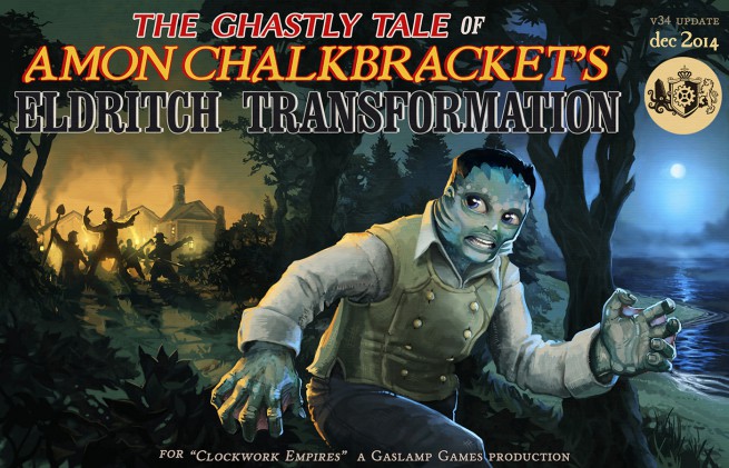
Our first entry set the tone:
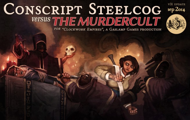
The first of the promotional paintings after the August 2014 early access launch, this one from September 2014.
The bombastic patch title are great fun to come up with but are somewhat awful for getting anyone to remember or link back to them. A third party site is only going to repost your 50 character long patch title once or twice before their layout editor tires of the joke. Same problem with, for example, the Steam announcements widget. Layouts simply aren’t designed for titles this long, of such bombast and unbounded Victorian effulgence! We persisted in the madness for quite some time, confusing many:

BANDIT RAID ON ‘FIGHTIN’ VICAR ZEDOCK WOODBURN’S FRONTIER CHAPEL (November 2014): 64 characters
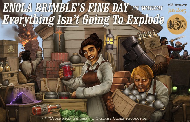
ENOLA BRIMBLE’S FINE DAY IN WHICH EVERYTHING ISN’T GOING TO EXPLODE (January 2015): 67 characters (the high water mark)
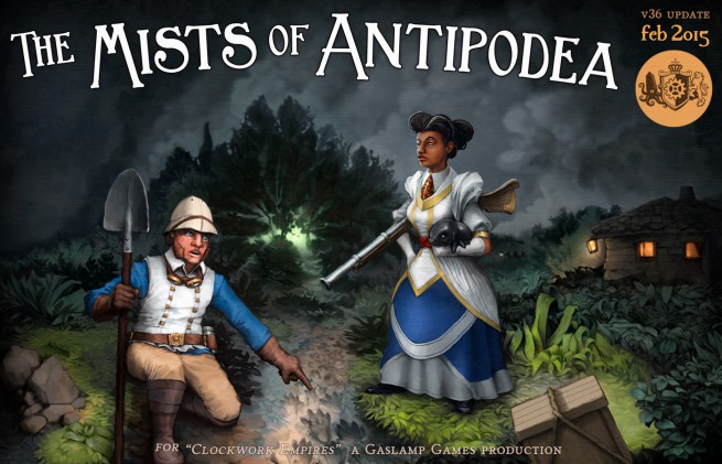
As hilarious as it was (to us), this practice was simply not practical in the long run, so we tightened things up starting in February:
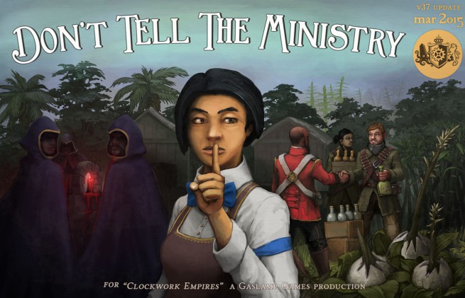
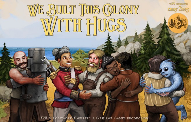
From here, titles became rather more succinct, based mostly around a turn of phrase or somewhat cliched pulp-feeling title. And occasionally just whatever seemed funny at the time.
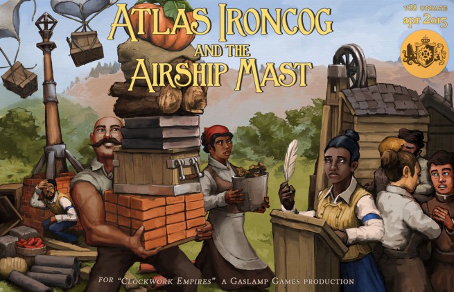
Funny story, for the next month Atlas Ironcog was originally going to be drawn making out with every character pictured because we’d just added the “making out” job. After some discussion, we agreed that this opened a few cans of worms that we wanted to approach with a bit more subtlety than that.
I mean, one simply doesn’t make out with an outlaw, right? It simply isn’t done.
You may notice that the last few months here are pretty similar in terms of composition. And heck, all of the illustrations are certainly part of a set, though the style drifts around a bit, and the composition is tighter some months than others.
There was a growing realization and conflict in these illustrations, trying to meet the standards of the last if not one-upping the last each time. The problem with doing intricate crowd scenes is that it’s a ton of work. Every hour spent drawing these marketing illustrations is an hour not spent working on the game itself. And the quality of game is the most important marketing point of all when you get down to it.
Project Management Tangent: — this applies to teams of a certain size. I’m sure we’re all familiar with the notion that throwing more humans onto a complex project does not linearly increase rate of work done. Each additional worker must spend more time dealing with the fact that they’re working with other people. There’s overhead from additional management time, paperwork, figuring out other people’s code, talking to other people about what the heck is going on, and even having knife fights over design.
A large company with many employees may find that putting teams on parallel non-interacting projects can use everyone’s time more effectively. So a company might have a development team on the one hand, and a marketing team producing videos and illustrations on the other (and a QA team apart from the code team apart from the art team… ), with less additional overhead introduced than if one were to just stick everyone in the same room. Gaslamp, however, is tiny and I’m the art director / marketing something? director? / gameplay programmer / QA tester / file clerk / and so on, wearing many hats in many roles, and allocation of my time is very much a zero sum game.
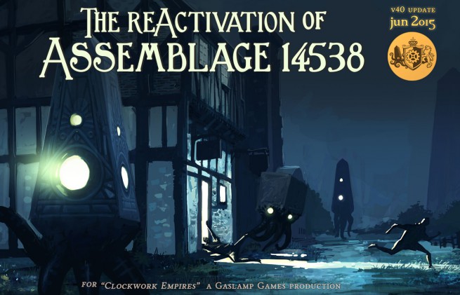
So: A happy alignment of subject matter allowed us to recycle an old promotional image for the June 2015 update, which allowed me to work more on the game proper:
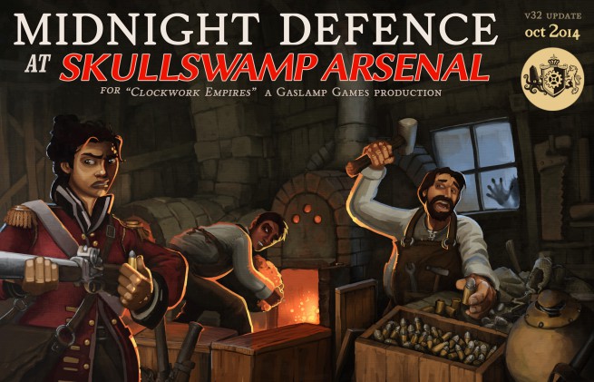
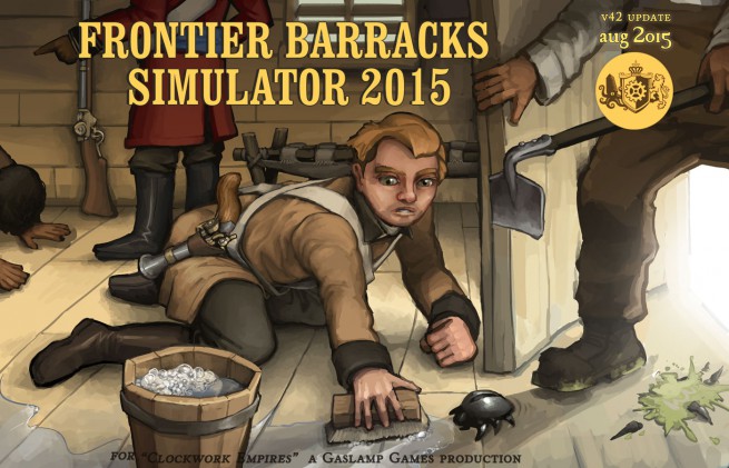
From here I’m still somewhat conflicted. Last month did not suggest for itself an art recycling so I had to jump back into the art mines:
But: no crowds. Kinda. Just one full-on character, plus a lot of chopped off body parts. And no foliage. Foliage, you ask? Why yes-
My greatest weakness: Foliage.
I love foliage. Clearly I’m just a frustrated landscape painting. I love just turning on a podcast letting it flow:
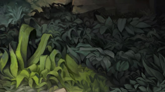
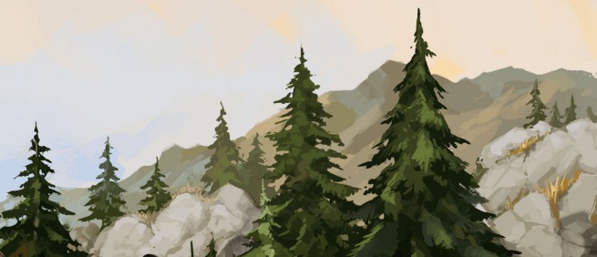
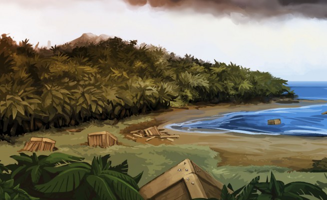
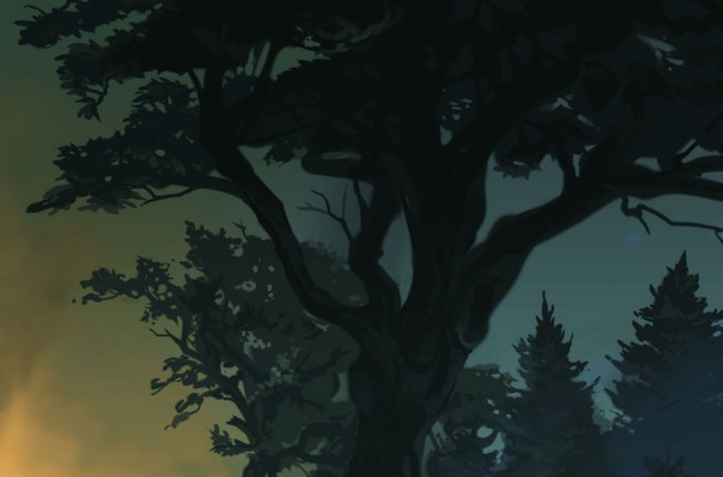
Yes, trees! Biomes! Small broadleaf shrubberies! Conifers!
But I must resist this siren call! To convey a key feature does not, one is told by a small voice in one’s head, require rendering every leaf in equisite leafy detail. Hence the interior setting of the latest promotional illustration (Barracks Simulator). And yet, I feel that I shall return to foliage one day. Just don’t tell anyone.
Apart from that, I really am trying to be less precious about painterly rendering, and am trying to push the rendering a bit back more toward comic-book with heavy outlines and simpler shading. So don’t worry, these illustrations aren’t going away; I’m just trying to use my time more effectively so we get a better game.
Since you’ve made it this far, how about something a little different? I was digging around in my archives and found the first concept sketch I drew for the idea that would become Clockwork Empires. This is now a couple days over four years old, but I think it still captures the gist of things:
And everyone is a bald, burly mustacioed man for … some reason…
ATLAS IRONCOG!?!


Nice man 🙂
Do you mind talking about your digital painting setup? I’d love to know what you’re using.
Thanks,
For me, the old reliable Wacom 3 is my workhorse:

(The new Wacom products are unfortunately flakey and less well made, very disappointed in the quality drop in the Wacom 4 & 5 series.)
Joseph, who did a good deal of the painting above, used a Wacom Cintiq (which I personally don’t like much as a tool – heavy, bulky, expensive, glare problems; but to each their own).
And all of this painting is done in Photoshop. I keep the tablet in my lap, right hand with the pen, left hand on the keyboard to change opacity, settings, switch colours, and hit hotkeys.
Here’s how I set up for painting in Photoshop, fairly straightforward:

Let me know if you have any other questions!
While we are on the subject.
How do you even come up with a image idea.
You have sort of a style and something you want it to reflect, but then what?
For example: I am currently doing a triptyk of old photographs I have taken in my life, but I only know I want a bridge in it and that it gonna be dark and broody..ish.
How do you take the next step?
I really enjoy your artwork. Possible to see them without the text?
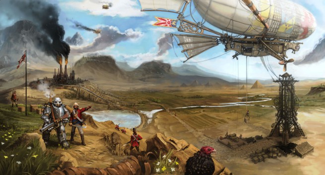
Credit where credit is due: Many of these are collaborations with Joseph (@JosephNejat), notably Murdercult, Skullswamp, Woodburn, Chalkbracket, Brimble, and the promo piece with the airship at the top. Joseph also drew the entirety of Assemblage.
I do indeed have copies of everything without text. Will give a serious think about how to distribute them; they are, after all, fairly large.
The Riker-themed clipshow was in Season 2 because that was the year of the writers’ strike, so they had to have as little (new) writing as possible.
(Also, yes, it had Pulaski in it, but it wasn’t her fault.)
I always love the art you do for each update. Echoing a comment above I’d love to get a hold of it without the text.
That Roach. Looks like a Queen.
Might have a wild hold nearby.
I’d recommend Beethro Budkin for that, personally.
Haha, I should’ve asked myself that last tag, but I looked right at that image without batting an eye.
On the other hand, if you ever decide to actually do a series of tie-in pulp novels, the covers are already done. 🙂