Oh playtesting, how you tear down my illusions, besiege the fortress of my ego then poison its well and set fire to its stores of grain.
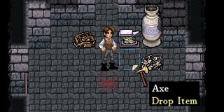
Fig. 1: The good part of Dredmor’s interactivity.
It is shocking just how surely a player will ignore tutorial text. The help button is effectively invisible, ignored, the text left sad and unread. Whatever it is, the “go away” button is clicked via Skinnerian response to years of training at ignoring inane popups. Yes, Nicholas passed me a link (or possibly a newer one) to Jeff Atwood writing on the subject when this issue of the tutorials being completely ignored came up, and it got me thinking.
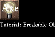
Fig 2. The bad. Don’t ask why it says “Axe” on that lightbulb.
We’ve got issues.
1: We need some kind of hook to get people to notice the tutorials, some way of breaking them out of the usual ignore-tutorials behaviour. I’m thinking of replacing the starting text dialog pop-up with an informative one-panel mini-comic which points to the tutorial button and the skill bar, which should be what people absolutely pay attention to. Everyone love comics, right? Or maybe it’s that people really hate lightbulbs.
2. We need to make our interface more intuitive, or at least cover the intuitive expectations a player makes of our UI; A player should not really need to read the tutorial if they’re familiar with common UI schemes of games in and around this genre.
3. Absolutely no one has understood using the skill tome and skill bar without being explicitly told how to do so. You have to open the skill tome with the skill button at the bottom of the screen, then drag appropriate skill icon to the skill bar at the lower right of the screen. Then you must left click to select a skill in the bar, and with a skill selected right click to use the skill. Possibly on an appropriate target.
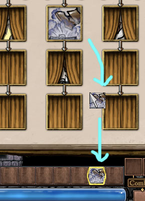
Fig 3. The ugly.
Actually, that whole process of readying skills to use sounds confusing when I write it out. I don’t think we noticed lots of things like this because we’ve been trapped in a bubble staring at our work for over a year. (So this is how MOO3 happened! That and a pushy publisher, which is a problem we’re lucky enough not to have. Ahem.)
On the other hand, there are interactivity schemes I’ve noticed people take to almost immediately. Pointing and clicking to move around and use things is something everyone seems to know. The first thing players do is start walking around and clicking on vases to break them, on enemies to attack them, then on items to get them – and when the item is attached to the cursor, it is intuitively dropped into a slot in the inventory bar.
Let’s look at Fig.1 again:

I notice now that we’ve been mixing metaphors with game object interaction: Why do skills not work like items? Everyone understands how items work in Dredmor with little trouble, can we not let a player ‘pick up’ and use skill icon instances the same way we let them use items? This demands baseless conjecture and rash experimentation. I have notified the relevant authorities.
Also:
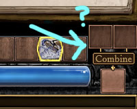
Fig 4. The weird.
No one at all has asked me about this little section of the interface and I don’t really know why; From all I can tell no one has even noticed it exists.
UI design boggles the mind.
