or: An Example of Artistic Iteration in the development of Clockwork Empires
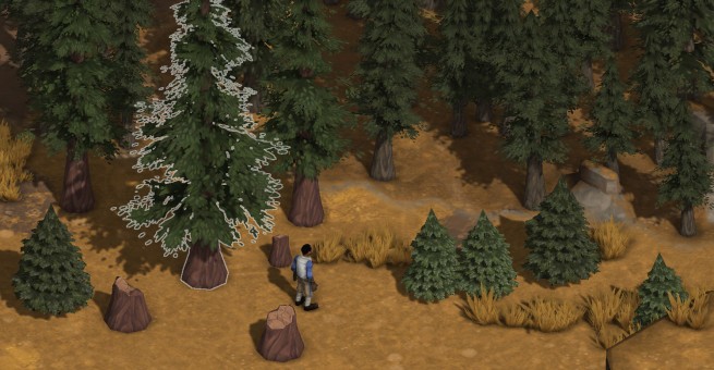
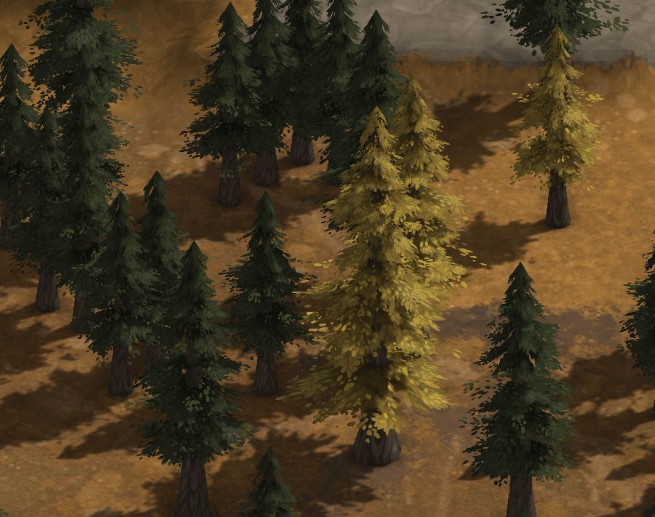
The much-improved pine forest as surveyed by one Mr. Rooster Dynamopipe. (“Rooster”? Who’s been screwing with the name list!)
Yes, we pine for the majestic redwood towering over the domain of Nature. But if the tree towers, how can you very well see what’s behind it? The majesty of nature is lovely until it means you can’t see what the heck is going on in your game.
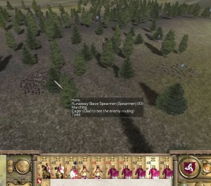
I have flashbacks of Rome: Total War which, apart from being a very enjoyable game, was not enjoyable when you ended up fighting a battle in a dense forest. Look to the right there; That’s a very sparse example of a forest and it has troubling issues with blocking your line of sight already. The denser forests got pretty packed and made fine maneuvering of units rather frustrating. This is what we want to avoid.
But still: the allure of Majesty! We can’t give up now!
So: In Clockwork Empires we have a few advantages over R:TW.
- Our camera is pitched at a steeper angle down so tall objects obscure less area.
- We have near-instant 90 degree camera rotation rather than free-roaming FPS-style camera.
- Our general gameplay and especially combat is designed to be taken at a somewhat more measure, slower pace (as discussed in particular regarding combat here) and therefore anything going on that happens to occur behind trees does not depend on the player doing split-second micromanagement; There’s time to maneuver the camera and figure out what’s going on.
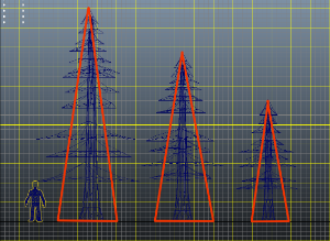
Trees: Now totally hella taller than ever before.
It’s a much more forgiving game context. Seeing as how Daniel had been putting so much work into getting a proper pine forest up and running for the Steampunk Colorado high prairie biome (as discussed in last weeks blog post) it felt like a good time to do the “large tree experiment” that’s been mouldering at the bottom of my TODO heap for quite some time. So, off to Joseph they went for some Science!
Side-note: Sean generally does this sort of stuff for environment assets but was busy adding “Rooster” to the random name list and creating a special desk for bureaucrats. To make up for his missing out on this one we’re going to give him the task of performing Science! on a broad-leaf deciduous tree of some kind to do some magic with foliage cards and normals-facing to create a bushier, faster, stronger, more life-like tree.
Right, the point of all this is that the results were lovely.
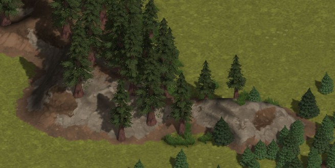
New redwoods on the left, old conifers on the right. We’re totally still using both of course, it’s a matter of the appropriate place for each.
I couldn’t leave it at that, of course. I wasn’t happy with the use of texture space – see below. The texture labeled “1” below was the old version with some blank spots initially used for additional foliage cards that ended up not being used. Here’s the problem: It looks good when the texture is large. But I want to be efficient about our use of textures (and there are a *lot* of different textures being used in the environment).
Being a cruel art director (but I repeat myself), I told Joseph that we had to cut the texture to a quarter of its size. Doing that, we’re going to lose some fidelity on the alpha channel of the leaves. This is a problem because the alpha/silhouette is a really important part of the foliage – if it looks chunky, then the foliage looks bad. My solution: use more texture space for foliage, less for bark. Heck, the bark is covered up by foliage for the most part anyway so we want to invest our limited space where it’ll have the greatest effect. This version “2” of the UV layout below.
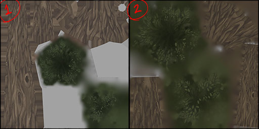
Artists love nothing more than redoing UV layouts. By which I mean they really don’t. But it’s the little things that bring it all together, isn’t it? And the suffering of artists?
Like the stripey shirt on the barber, there are a thousand fiddly little details like this that must be addressed in the course of developing the art for Clockwork Empires and it is our Science! that keeps them in line, that keeps the Chaos at bay, that keeps THE EMPIRE strong! And I’m getting carried away again, ahem.
So off we go — bigger trees! Lovely. And I’m going to get as much mileage out of this model as I possibly can – you can see in the shot at the beginning of this post that I’ve done a less-red & darker-needled version of a generic pine tree for the Steampunk Colorado high-altitude pine forest biome. By the end of this I’m going to have so many happy little trees to share with you. So many.
In other news, Mr. Christopher Whitman (suspected wizard) leaves us today in order to pursue a career in (Magical?) Law. We wish him well in his future endeavours.

I love the trees! David you out did yourself.
knowing next to nothing about character maps, can you designate certain parts ‘foliage’ and certain parts ‘bark’ and give them color ranges in which they could randomly choose from (and thus a slightly random palette) for that play through?
Sad to hear that Chris is leaving! Us rabid fans still want a brief employee bio page!
This reminds me of that episode of Bob Ross’s The Joy of Painting where Ross started painting “happy little cultists” in the woods. Sadly, the episode was never rebroadcast.
Probably because he started painting “happy little Dark Young”. Huh, after saying that it seems like a contradictory statement.
Nice looking forests! Another good technique is to outline any character hidden behind something, so you can see the outline of things that would normally be hidden.
I’ve always had an interest in Magical Law.
“You’re a mage, Mr. Gage /
Judge, won’t you please encage the warlock Mr. Gage!”
I like posts similiar to this one, it really gives you a nice behind the scenes look at what game devs do.
Also, being from Wisconsin, i would really prefer if i could have a naturalist named Cow fuddlepond?
Much praise from the botany corner. You’re guaranteed a sale, even if the darn thing doesn’t run on my computer. I just can’t believe the amount of love you’re lavishing on the landscape and plants.
Best wishes to Mr. Whitman in his next adventure!
I love the lighting you’re getting on the trees (especially the last image)! Are you doing any special tricks or are the foliage cards just casting shadows on each other/tree bark/ground? Does this approach scale well with lots of shrubs and trees in the scene? I’m guessing LOD kicks in for card size/resolution/shadow maps?
Excellent update! Very much looking forward to more 🙂
No special tricks with the shadows – they’re just shadows cast by the alpha of the cards. Nicholas may be able to comment further on any graphical programming spells he’s cast here.
We don’t actually have any level of detail aside from mipmapping. The nature objects are built to be shockingly simple so that we can jam lots and lots of them into a scene to get it nice and lush. (There was, however, a problem with the gameplay-logic objects behind individual grass and trees being too sophisticated and causing the game to explode. That’s fixed easily enough – just make foliage a simpler type of object – but that’s a story for another time and for someone else to tell.)
The trees look significantly less delicious than last week. However, they do look more aesthetically pleasing. You know, many parts of the pine tree are edible.
Also: Please keep “Rooster” in the name list.
From game design to law – Mr Whitworth is entering a whole new world of pine.
Keep the weekly updates coming, please – they are my Thursday guilty pleasure.
Progress!
Cool! Loving the redwoods. They remind me of the firs back home in the Pacific Northwest. Here’s hoping you have a temperate rainforest biome, ripe for the lumberaging.
So perhaps, view wireframes when obstructed by terrain/trees/etc (i always that that was an elegant solution presented by syndicate wars and then Torchlight, although iirc they did it in two different ways)? Fine maneuvaring by context? that is, your soldiers don’t know how to chop trees (even if they were drafted from the tree cutting peasantry) … so if you have soldiers selected, you wont get the option to click trees (and thereby issue confusing attack tree orders instead of maneuver to this location order for great cunning).
We’ve got an edge outliner for this sort of thing as you can see in the outlined tree in the first screenshot. It gets a little funky around textures with complex alphas, but plays much more nicely with characters and objects. As for how we end up using it in conjunction with other tools for showing obscured characters is going to be a matter of playtesting and iteration.
Of course, in a forest of reasonable age, lower branches start disappearing on trees as they enter the darkness of the forest itself. Probably too much to ask for to model that much, but it was the first thing that came to mind looking at the screenshots.