(– Unless, of course, it is.)
Let’s talk about rocks. And let’s start with a screenshot from in-engine:
I hope we’re all familiar by now with how excited about the mundane I can get, see: loading bays, trees, etc. Rocks are totally mundane. But getting the mundane things just right is super important because it ties everything else together. High-poly fancy fantastic amazing show-off hero models & apocalyptic effects and animations are impressive, sure, but they need to exist within an artistic context that supports the claims they make and gives them meaning which resonates beyond their superficial visuals. Rocks tie the landscape together; The landscape is the stage on which the dramas of Clockwork Empires take place. Together they tie the whole game together.
So you see, rocks are important!
That said, we’ve had our, ahem, rocky starts and missteps which required iteration & experimentation to find our way. Here at Gaslamp we’re dedicated to using “Science!” — a more exciting and less accurate form of “science” — to solve our problems. In other words, we do aesthetic experimentation. If something could be better, we look at what other people have done, give it a think, see what we can use from the ideas they’re working with, then do an experiment and adjust it to the needs of Clockwork Empires. I’ve got a few experiments related to rocks to show you today and their results, together, gave us the shot you saw at the top of this post.
Experiment: Of Tiles & Minecraft
CE is fundamentally a tile-based game. Tile-based games go back a long way and, speaking for myself, I have many fond memories of A-Train, Caesar, Settlers, Anno, Sim City, and so on. Most of these games have rocks of some kind, so why not the traditional approach? Take some rocks, dump them in a tile (or weird hexagonal space), and now you have rocks.
This was also an early, confused period of CE’s development where we were experimenting with all kinds of crazy things like Minecraft-style voxel-looking terrain (we were young! it was cool!), or perhaps terrain that very strongly acknowledged that, yes, the entire world is built of tiles by having the tile borders draw distinctly into the grass & dirt of the terrain itself.
It was alright. But merely alright — if rocks are neat little piles set into their tiles, you get none of the majesty of mountains or the brute power of boulders. Just neat little stacks. CE is about a world bigger than that.
Experiment: Diablo 3 Rocks
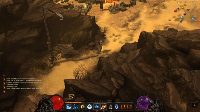
Diablo 3 has amazing environmental art and there’s one weird trick to why they got away with it so easily. (I mean, aside from having a huge pile of cash and hundreds of artists and years to iterate on everything.) — And I’ll get to that in a sec. First, this:
I wrote up a ticket for Sean Hamilton, our environmental artist, to try to capture some aspects of these rocks. I wrote some of what I liked about them: “jaggedness”, “emphasis of edges which are jagged; sharp edges, though stylistically still quite painterly”, “sense of layering in geometry”. I think he caught that pretty well:
The difference between Clockwork Empires and Diablo 3, aside from everything else, is their one weird trick: a mostly-fixed camera angle. That and hand-crafted environmental pieces (which we may investigate aspects of, but that’d be a Daniel post) is why having beautifully painted, unique & individual rocks doesn’t look so awesome for us. We’d stick them down into the map randomly but each rock looked too much like itself, like a unique individual. Seeing it, you’d say “Hey, I know you — you’re that rock!”.
It was all very awkward. Especially for that rock. And ultimately it didn’t let us build a very cohesive landscape when taken altogether.
(For more on weird tricks, check out the talk that Diablo 3’s art director gave at GDC 2012 which was made public, he goes over a lot of what they did (which is fantastic), see here.)
Experiment 2: Planetary Annihilation Rocks
Alright, where can we find some pretty rocks — how hey, what’s that? Planetary Annihilation is a thing and it’s a thing with gorgeous concept art? Yeah, we follow the news. and look closely for developments relevant to the work we do, whether from the standpoint of gameplay, technology, or art.
So I made a ticket for Joseph Nejat, our character artist (who is making rocks, yes; truth is that we’re a small studio so there’s a blurred line between all the art positions): Can we capture what’s going on in those lovely little Planetary Annihilation rocks? Here’s what I wrote:
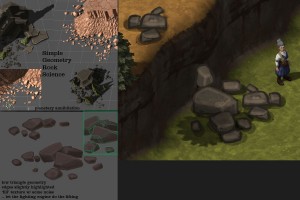
“What I think is going on is some fairly simple blocky shapes, stylized ideas of rocks, with a bit of edge highlighting to play that up a bit. Can pull terrain rock-face textures as a base — and these should be fairly flat — so that the geometry rendering & shadows they cast does the heavy lifting.”
This is almost the opposite approach from the Diablo rocks. Way less painterly, very low poly, using fairly flat textures so that the simple geometry of the rock itself interacting with the lighting expresses their form.
As you can see on the left, Joseph has an uncanny ability to reproduce assets from other games. They are a bit dark in-context though, colour could use some adjustment, and the scale is a bit limited, but those are PA rocks. So um, let’s not actually use those straight-up because Uber is going to totally sue us.
(Tangent on the subject of reacting to other people’s concept art: Patrick Wyatt has a fascinating series of blog posts about working on Starcraft — the first one — and how the game was entirely rebuild in part as a reaction to a competing tech demo the team saw at a trade show. But it turned out the tech demo was a pre-rendered movie with someone puppeting the act of playing the game. And guess what, that game was never released. But the takeaway is that Blizzard held themselves to someone elses’ impossible standard created by fake promotional art and it turned out great. Not that PA’s promo art was passed off as the actual game like those other guys, but the nature of concept art is that is is made in a very controlled environment so it always looks better than a real game. We’ve made some promotional renders here too and we do intend to exceed the standard they set. )
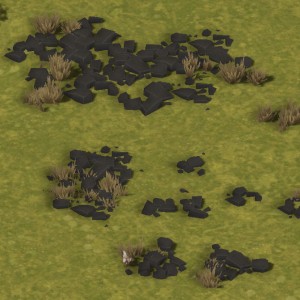
Still, we got some cool rocks. I overlaid the ryholite rock texture used by the base terrain itself, did a bit of colour adjustment, asked Joseph to do a few more size varieties, and we got some great scree material.
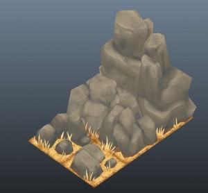
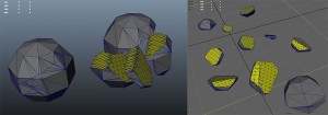
Scientific! aside: One idea Joseph dug up was taking a piece of geometry and running a shattering simulation in Maya and using those pieces as a basis for Planetary Annihilation style rocks, see to the right. Breaking stuff is cool, but the results are so high poly that the time it’d take to clean by hand would give better results if he just started from scratch.
Experiment: Lumpy & Blocky Rocks
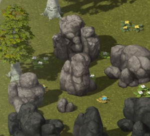
They’re like cold, unresponsive friends: Always there for you. Just cold and unresponsive. But you gotta work with what you’ve got, right?
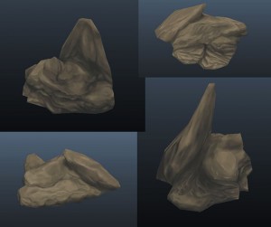
Back to Sean: At some point I figured there was still something useful we can get out of a middle ground between Experiment 1 & 2, not so much as a reference to another particular game but as an iteration of the ideas Sean had been working with so far. I asked Sean to do up some “lumpy” and “blocky” rocks (with about that much description plus a sketch; and that’s how you art-direct). The results are to the right.
But we’ve still got a bit of the problem of the painterly rocks: they’re a bit too beautifully and individually rendered. Solution? Blurring & lowering contrast on the texture, and Sean doubled their size thus transforming the particular-object-looking details into something larger & more vague, more like aspects of the landscape. This lowered the resolution of detail to make them read more as background than subject.
Meanwhile, back At The Mine…
This brings us back to here, a hand-arranged set-piece assembled completely in-engine:
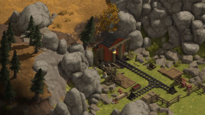
The happy little mine again! Hello happy little mine. How are you? Not collapsing? No underground springs waiting to flood us out? No pockets of explosive, poisonous gases? Splendid!
The rocks tie the hand-modeled objects to the procedurally-generated terrain, they bridge the gap of broad landscape features to the fine details of objects & characters. Then the shadows and ambient occlusion do their magic so you can jam it all right up together and it all looks like it was meant to be.
It’s starting to look like a game.

This is all well and good, Mr. Baumgart; but if the game comes out and I don’t feel the urge to say “Hey, I know you — you’re that rock!” to at least one in-game rock after reading a full article on virtual rocks, I will be disappointed.
Good day.
I think you guys already surpassed the promotional art, which is a very exciting thing. (almost as exciting as rocks)
Gaslamp Games rocks.
Had to say that.
Argh, the mine picture makes me really want to play with train tracks. XD That’s probably a bit feature-creepy.
The game looks beautiful. Can’t wait to play it!
Despite the rocky experiments, the overall result is very sharp! Keep the articles coming.
I really liked this post!
My only remark is that all the rocks look very eroded. Kind of like the type of boulders you’d find at the foot of a mountain, knocked loose and worn down. I mean, they look really great. But if the terrain around it isn’t mountain-y, won’t it look terribly out of place?
All the rocks in the mine picture, I meant*
Will we be able to see some in-engine gameplay soon?
If I told you the answer to that I’d have to send you to The Colonies with that knowledge.
I really hope the shattering simulation is implying that we’ll get to see something like that in-game.
Also, I wonder if we’ll actually get to go inside the mines?
Or would subterranean exploration and underground things be too complex and time consuming to add?
Really unlikely that we will do shattering simulation. There aren’t any readily available easy ways to implement this sort of thing in a way that wouldn’t tank the performance of the game, and there are a lot of areas that the time that would take could be spent in a way that’ll make more of an impact on the way the game plays.
We’ve also decided to not do a mine interior, due to some challenges that causes and just a general philosophical decision not to be a “mining game”. We’ll represent the mines somehow, but they won’t be 3d terrain representations.
A 2D mine map would be a cool, and maybe not as resource intensive, way to represent the mine interiors. Either in Dredmor style or maybe make it look like a hand drawn 1800’s mine layout map or something.
As long as I get to see ‘something’ blow up or catch on fire, or other general mayhem of the sort, i’ll be happy.
I see your point about the mining, though i’ll still grumble about it.
I think the 2D overlay thing might be interesting, or perhaps even turn it into a crudely drawn map.
Starting out with a blank sheet of parchment, but then the workers add little scribbles and things here and there as they explore and report back to you.
Looking gniess! The articles on the small mundane dev stuff are always quite interesting.
Now an important question is-If i find a nice looking rock, can i order my people to pull it up and transport it to another spot of my choosing? / Can i build Stonehenge?
I like big rocks and I cannot lie!
This post rocks! Really looking forward to meeting all the CE-rocks…
“But getting the mundane things just right is super important because it ties everything else together.”
So when are you going to start working on rugs?
Bam! http://www.gaslampgames.com/2013/05/29/starting-gear/
And I even remember reading that at the time!
It really does tie the room together, doesn’t it.
I really like what you came up with. They pop without drawing too much attention. They also have a good, I donno, “resource” look to them. Like you could mine those rocks.