One of the major reasons behind announcing Clockwork Empires – as I think I mentioned before – is that we want to talk about what we’re doing. We want to keep you in the loop, and we want you to feel happy, informed, and involved. Accordingly, we’ll be posting lots of work in progress stuff. Again, this is a work in progress and will not (and does not, even!) represent what we’ll be shipping in a year and a half; this is a catalogue of the journey, but not the destination. However, it’s a pretty interesting journey.
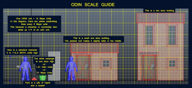
Yesterday’s moment of excitement was discovering that all our characters were too small, and occupied one sixth of a “game tile” rather than one quarter of a tile. Queue massive re-export. Ah, well. These things happen in game development, and we deal with them and we move on; the key thing is to try to make sure that it doesn’t happen again.
So, let’s not talk about that. Let’s look at some screenshots. Because we’re vicious and evil, we’re not going to show you up-to-date screenshots; instead, we’re going to show you things from the cutting room floor. Way back when we started Clockwork Empires, we put a screenshot button in the game so that we could easily take pictures of our work for analysis, sharing with friends, putting up on the blog, whatever. Because we did this so early, we have an interesting collection of archival footage. So here’s some stuff for anybody interested in seeing how you pull an engine together.
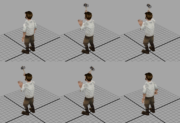
To get you in the mood, here is a construction animation:
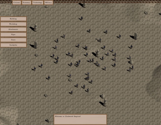
This is the very first screenshot I have on file in the work folder. A small collection of Empire citizens are wandering around on a terrain, moving from grid square to grid square at random. (Actually, they may be walking in place.) Shadows were put in very early, simply so I could see if people were in the right place or not (or where they are.) Because CE runs with an isometric view, it’s important to have early depth cues.
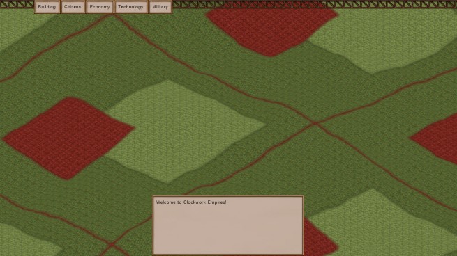
Here is an early terrain test. It menaces with spikes of blending. Note that all terrain in Odin is divided into terrain chunks; we only draw those chunks that are on screen at any given time. (This is very standard.) Note also that the blending of textures across adjacent terrain chunks isn’t working in this screenshot; this was fixed later.
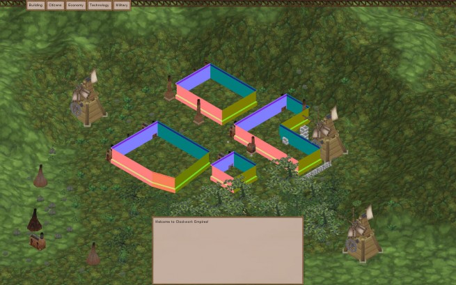
A few ramshackle procedural buildings, strangely devoid of tops (or decent geometry); some more terrain tests; and a collection of windmills and trees. The big drama here, of course, was that windmills have two-sided geometry, and trees have alpha-textured geometry. Photoshop, bless its little heart, stubbornly refuses to export separate alpha channels in a PNG file, so we recently ended up switching everything over to TGAs. The scale here is also kind of, er, wrong.
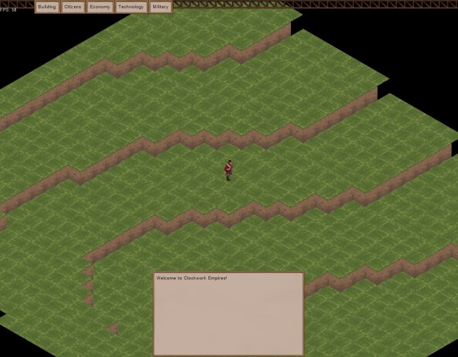
At this point, David decided that the terrain was insufficiently discretized. So there was a weird period of Minecraft experiments:
We eventually gave up on this for a number of reasons (“too blocky” being one of them); but we went through a number of interesting prototypes. We finally ended up converging on something like this:
Agh, that hideous white spackling on everything! It burns! Fortunately, the great Re-Exportening is upon us, and all props shall now be re-exported with correct textures and models, in the name of the Holy Cog.
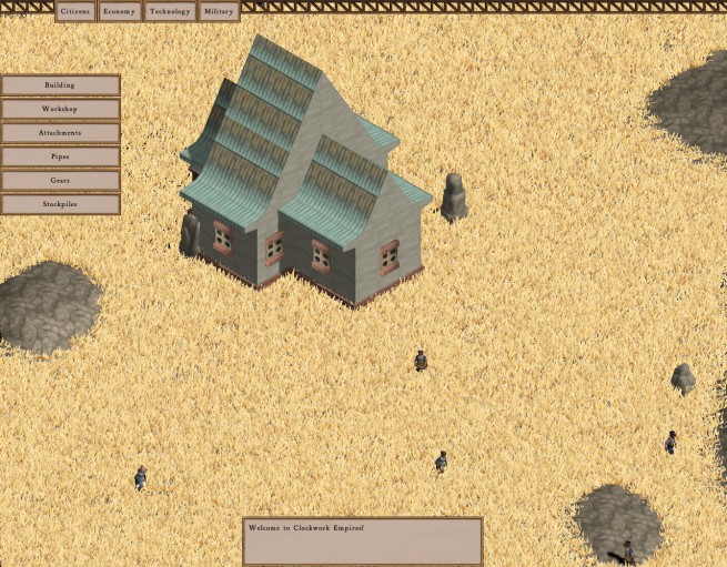
Those lumps, you see there in the background, are some early procedural buildings. You can see they’ve come a ways since shot 3; in particular, they’re textured. They’re not lit, for whatever reason, in this shot. At this point, the main problems with the technology are two-fold: first, an artist needs to go through and make nice profiles instead of whatever I’m doing here; second, procedural buildings still occasionally explode. Here’s a particularly memorable explosion:
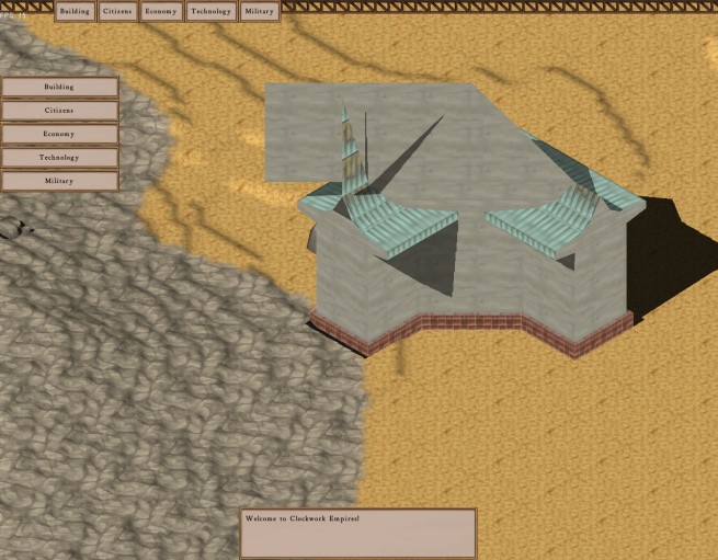
We still have a few of these, but less than we did; I need to spend a couple of weeks finishing this off, but right now I’m busy working on AI code with Daniel and Chris. (More on this in another blog post.) There was another particularily long and memorable battle with terrain code somewhere in here; Daniel was working on a system that did procedural erosion, which was quite interesting, but we ended up going with something that mainly uses convoluted Perlin noise and a bunch of ramp functions as its basic primitive.
At some point we also built a profile editing tool:
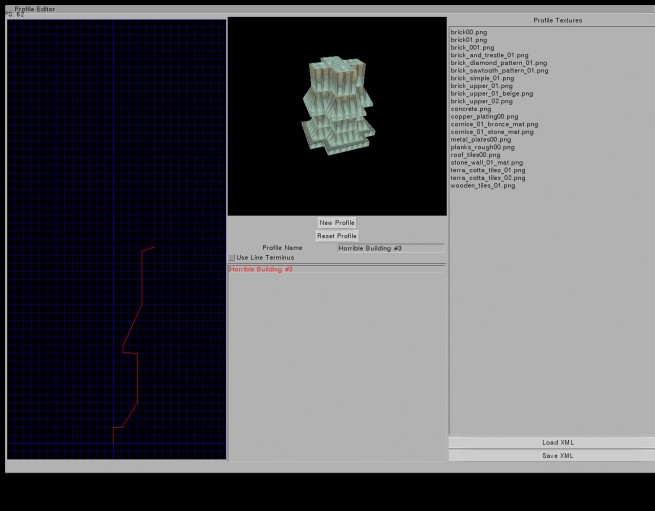
We have our own user interface toolkit, called Illusion, which lets us put all our tools in-engine. Modders will be happy. Here, you can see some kind of bizarre metal mess profile; if you look in the corner, you can see a preview of what a (very small, T-shaped) building might look like with that profile assigned to all sides. Of course, you would probably never want to do that; instead, you will combine multiple profiles to construct a building, with layered elements on top of each other for towers and new structures, and domes and windows and doors and things. Sean is currently gunning through these at a frightening rate:
At some point, we also tested a grass renderer.
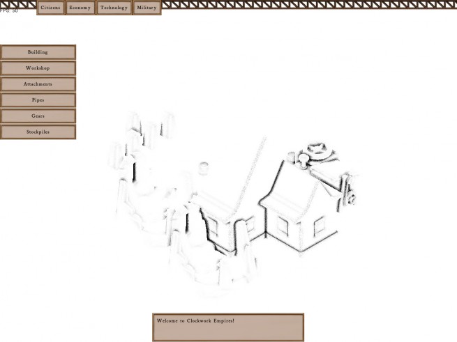
and the traditional Ambient Occlusion that plagues all games:
This is before I put in the blur pass, so what you get is a very concentrated spackle. Still, SSAO does a lot to pull the windows and other elements away from the procedural building and out into the world. Here is the same scene, multiplied with just the albedo map:
At some point here, the shadow code also got rewritten. We went through several implementations of shadow mapping; at first, we used Variance Shadow Maps (VSM) but found the floating and light bleed-through was just too obnoxious. We eventually ended up settling on a 9-tap PCF, which I’m very happy with further away but which still exhibits some pixelation artifacts close-up. I’ll take another swing at it when I get time.
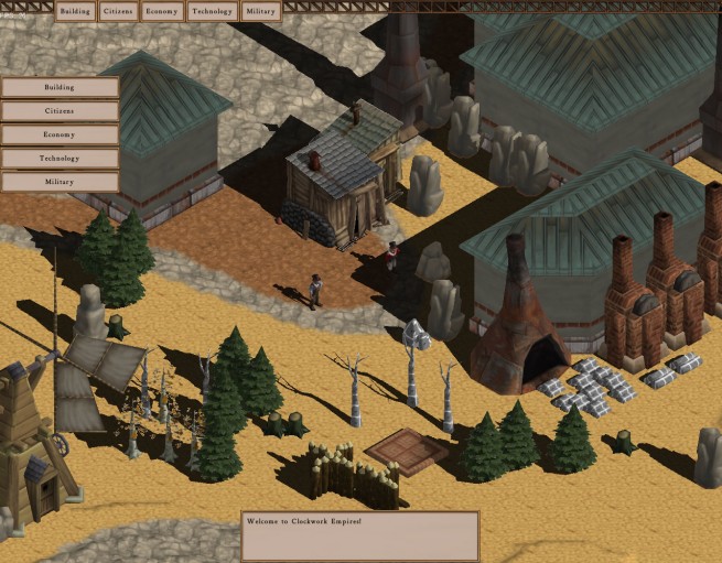
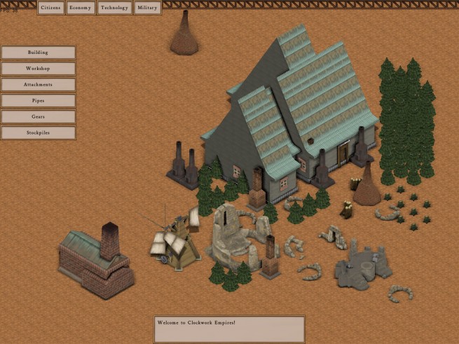
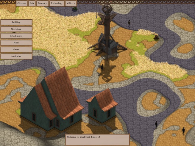
Once you start pulling all these disparate little bits of work together, something that sort of starts to look like a game emerges:
… although, as David commented upon seeing this screenshot, “the game appears to be decorated like a collection of 70’s appliances.” There’s various places here where the lighting is out of whack, because at this point we haven’t fully moved to a deferred rendering pipeline and a bunch of things are each using their own weird little version of shader code, et cetera, et cetera. All things we’ll have to address, but in due time.
Next up: fun with artificial intelligence.


Looks great, guys.
One thing that I always found amusing were animations in games that were so generic as to be bad. Your construction animation, however, is quite good.
Have you considered having non-literal animations – for example, having the construction guy sweep his hands over the building being constructed a la Mr. Miyagi “scrub the deck” and having the building magically grow under such fine craftsmanship? Might be amusing to see something like that happen here or there.
Nice article, it is looking good!
I’m really looking forward to reading your AI endeavours.
Pingback: A Look Behind ‘Clockwork Empires’, Gaslamp Games Talk Engine Development | The Indie Game Magazine - Indie Game Reviews, Previews, News & Downloads
This… is looking amazing already. Great job Gaslamp!
“Welcome to Clockwork Empires!”
Pingback: A Look Behind ‘Clockwork Empires’, Gaslamp Games Talk Engine Development | DIYGamer
Fantastic!
Thanks for posting this! I love seeing the process behind indie game teams – everyone finds their own set of problems, and it’s great when developers share any insight they gain with the rest of the community. Keep up the great work, guys!
There aren’t enough tags, I dare say.
Yeah! What is up with that? Maybe tags are inversely proportional to the amount of content! This thing is amazing.
I hate to be a critic here, but I am having a hard time telling which parts of terrain are higher and lower in the last shot.
About the only thing that looks like it is not part of a wierd flat colored landscape is the hill on the bottom left, which the shading does contribute to a higher looking appearance…
..but the shadow of the hill seems to conflict with the shadow of the building, casting a shadow into the light source of the picture (directly north er top).
Terrain normals aren’t quite being calculated correctly yet. Part of that is also the isometry; part of that also means we need a shading cue that changes the higher up we go, because we’re isometric.
Don’t worry, we’re on it.
Awesome work guys!
Hey cool post! Nice to read and get an insight 🙂
Shut up and take my goddamn money!
Pingback: Technology Status Update | Gaslamp Games