And we really hope you like it.
Our first website was a labor of necessity: we needed a quick and easy way to impart some of our weird sense of personality while keeping you guys up to date on the stuff we were working on. This time we decided to spend some time getting the site up as we always wanted it to be. Classier, friendlier, and maybe a little more eccentric.
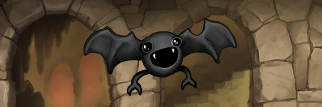
A tremendous “Thank You!” to the folks at Chestnut St. Pixel Foundry for putting up with our demanding requirements regarding the look and feel of the site; they did a great job of capturing the “Gaslampyness” of Gaslamp Games in the redesign of the site and rebranding of our company. (You saw the new logo, right?) Props also to their production assistant Stephanie Larsen who drew some lovely background illustrations of Dredmor paraphernalia that will appear, appropriately, at random. (Blatant plug: Go hire them and her, respectively, for your web design and illustration that needs doing.)
Also, as ever, a big thanks to Derek for the behind-the-scenes database DJing, without his work things like changing the website would be laborious hours of downtime and mass-confusion.


I like the new site, its very clean. The only issue i have is that the font is very thin, and it makes it kinda hard to read, but as that is the only issue, i really like the new layout.
I was actually going to post something similar. The font size is a bit tiny– could you increase it? It’s not bad if I zoom in on Firefox, but then that makes everything else bigger also. Looks great otherwise!
Nice, very nice!
Looks very awesome. Much easier to read too!
I loved the old steampunk background site.
Awwww I thought 1.07 had hit! Well even still the new website design is pretty nice 🙂
Honestly, the older one was more stylish. The way stuff is organized make this one easier to read, though, but I still prefer how the older one looked like.